Velora
A guilt-free ice cream that had to look as indulgent as it tastes. Self-initiated project.
Meet Velora
A reputation problem
Sugar-free ice cream has a reputation problem. Most people who've tried it remember the icy texture, the flat taste, the feeling that something essential is missing.
Velora is a Madrid-based brand entering the Spanish and broader European market. It needed to overcome that stigma before anyone read the label. It had to appeal simultaneously to health-conscious parents and to children looking for a treat.
Want it before they read
Putting the 'no added sugar' claim front and center immediately triggers associations with compromise. Customers feel that they must choose between healthy ice cream without the right texture, or creamy ice cream full of sugar.
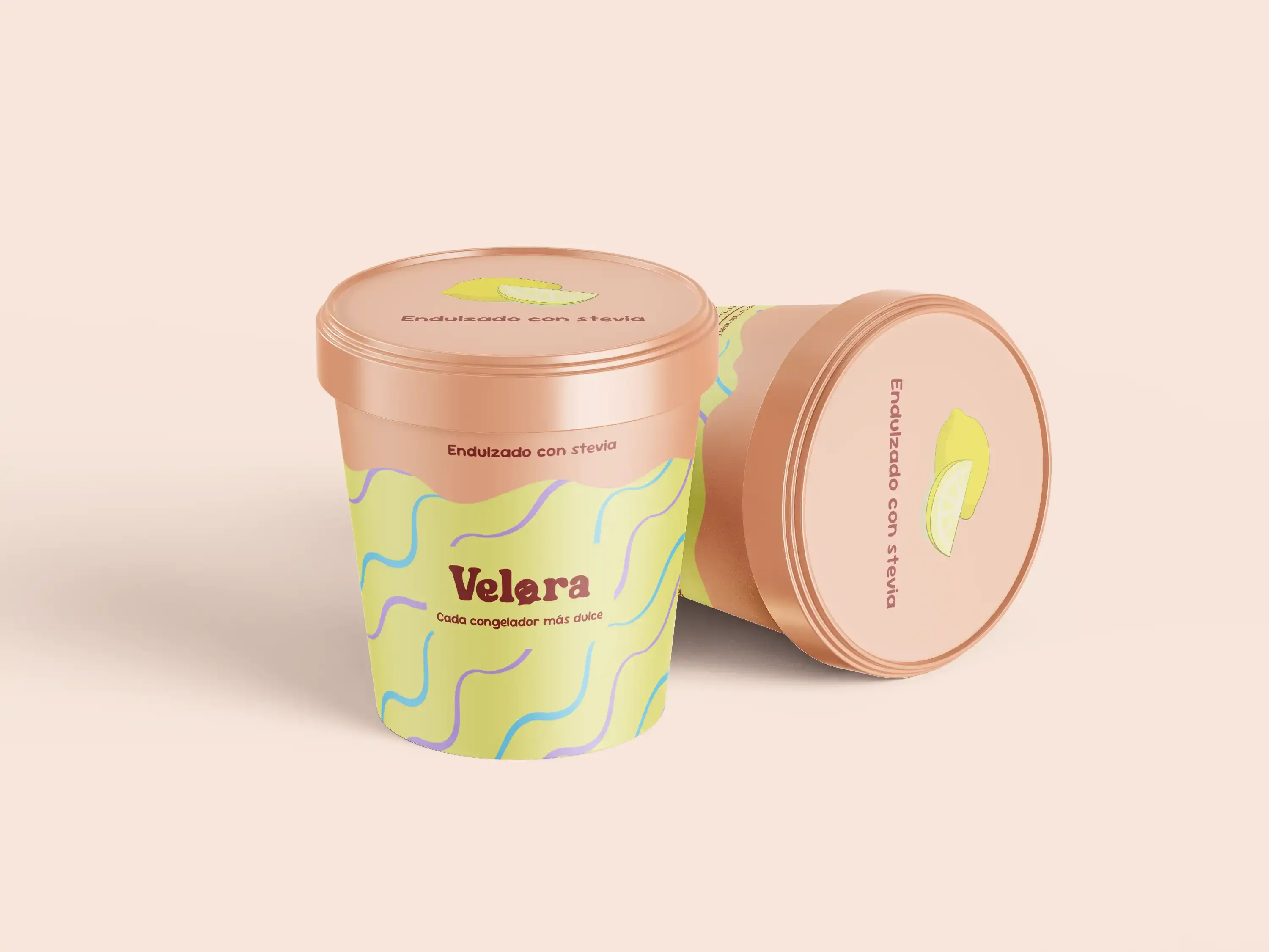
Make Velora look and feel like a treat. Every visual decision should make customers want it before they start reading.
The design process
Built to feel like a treat
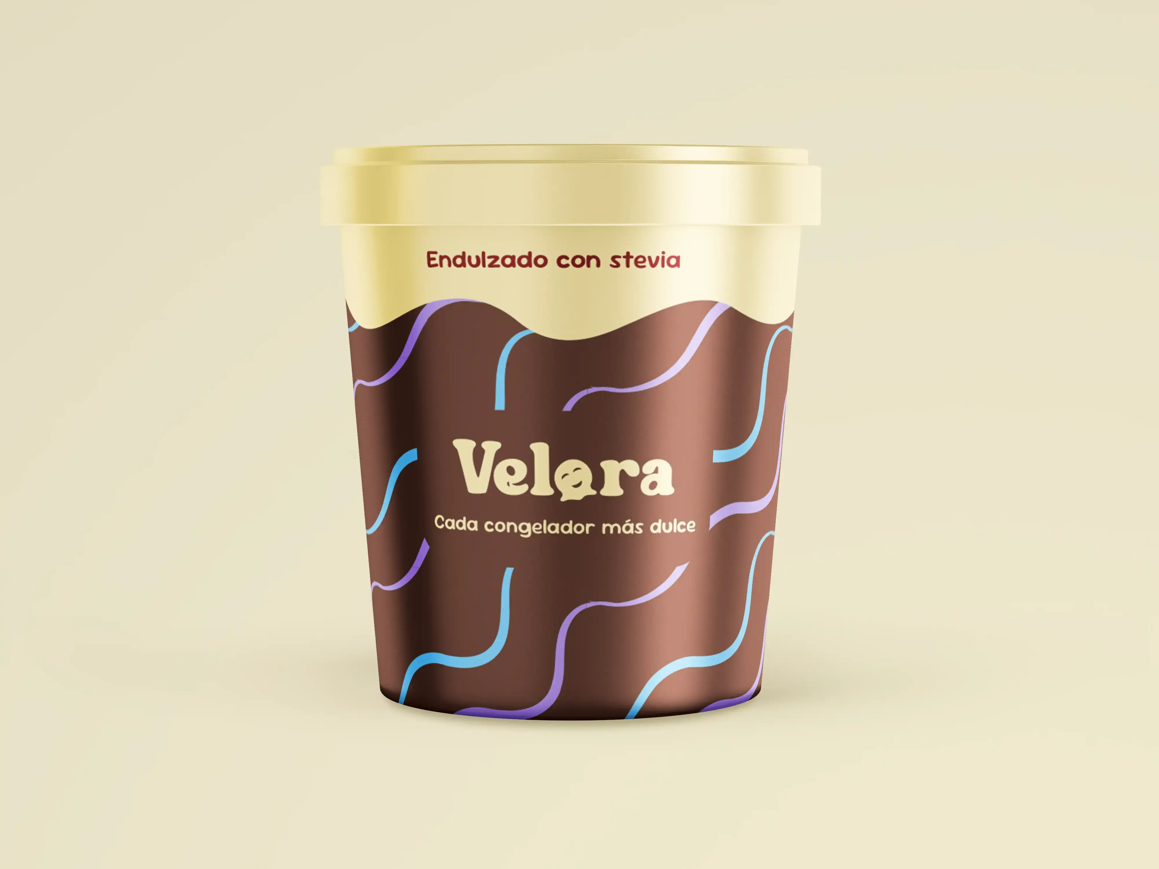
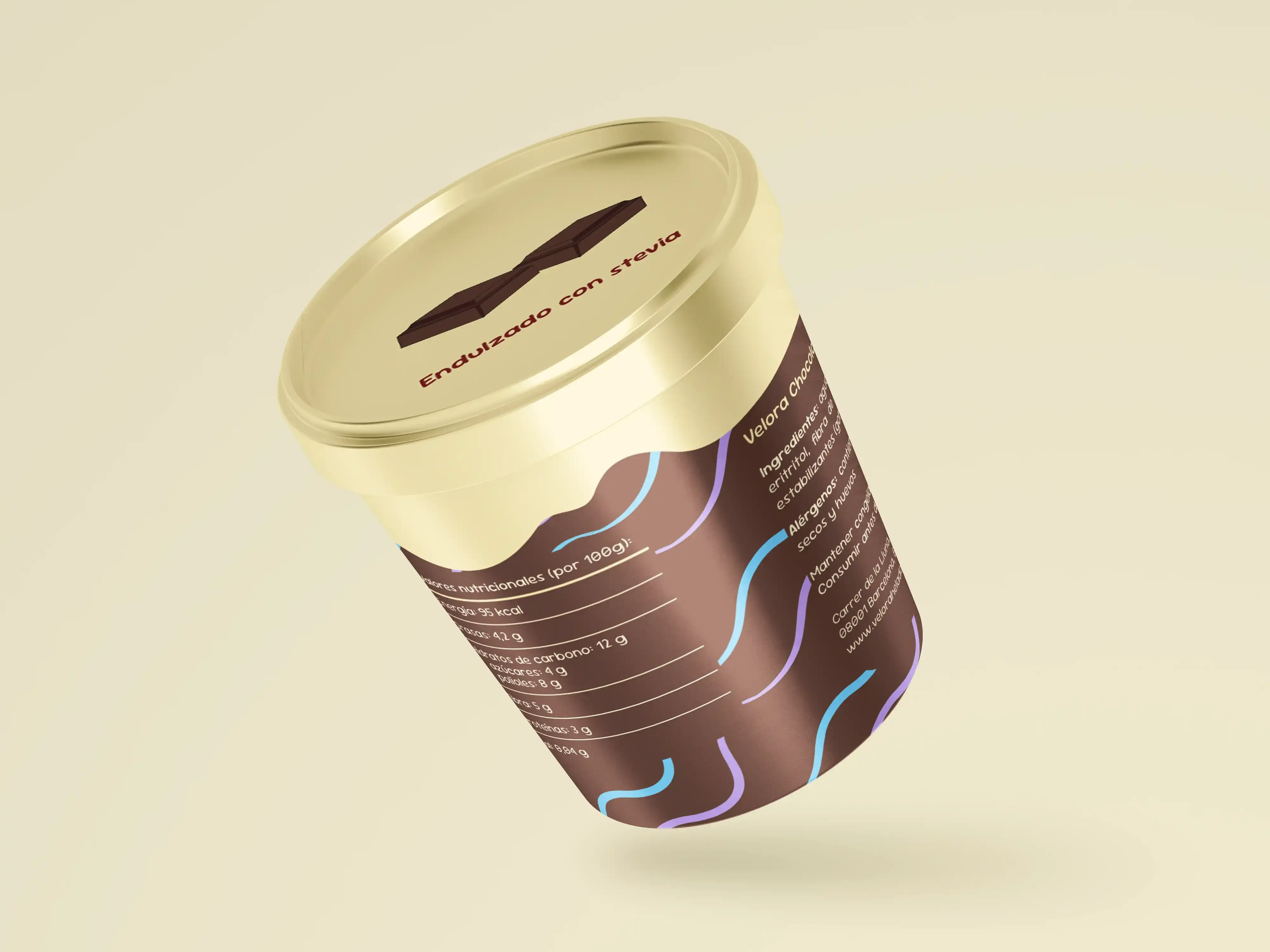
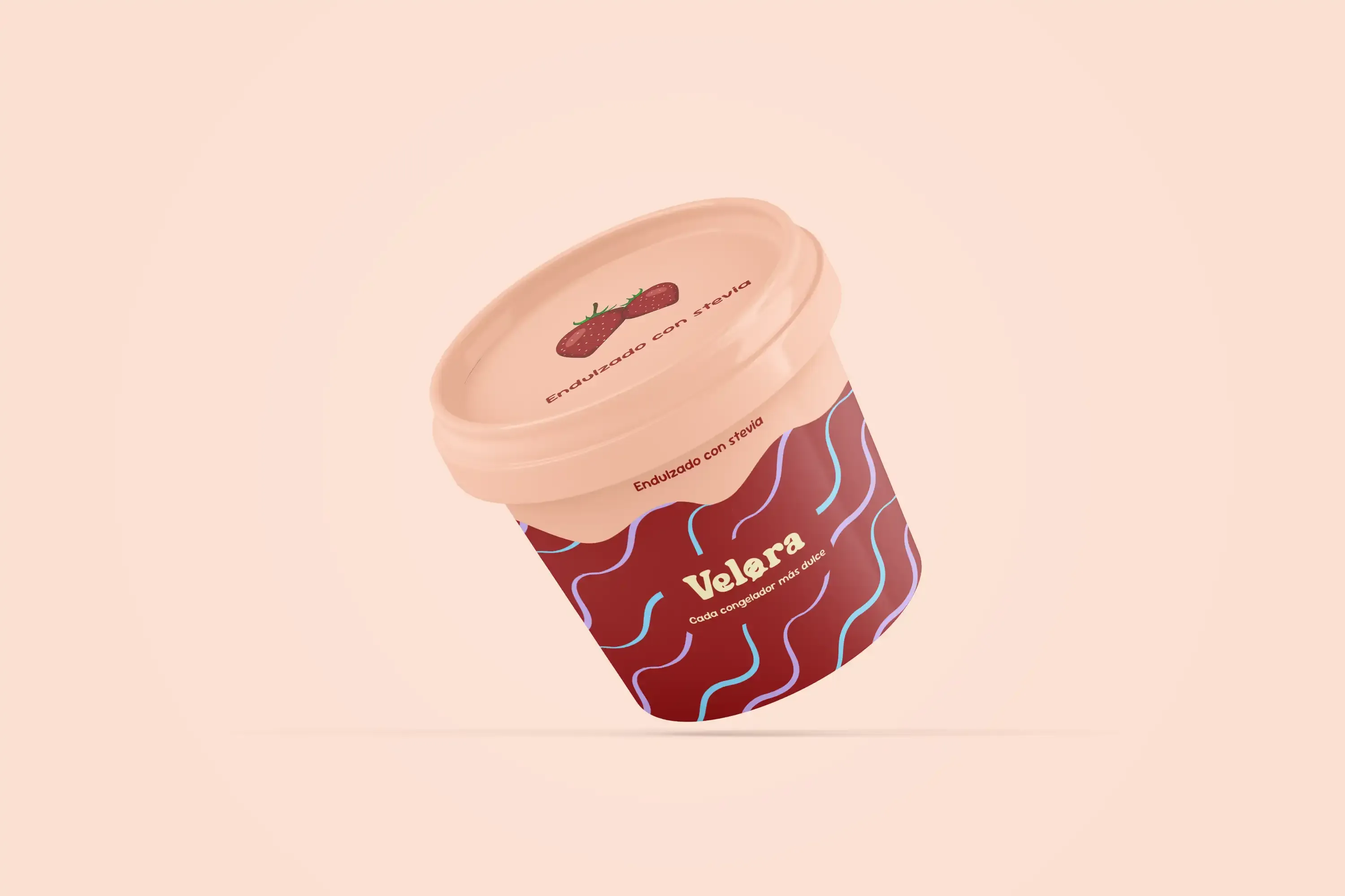
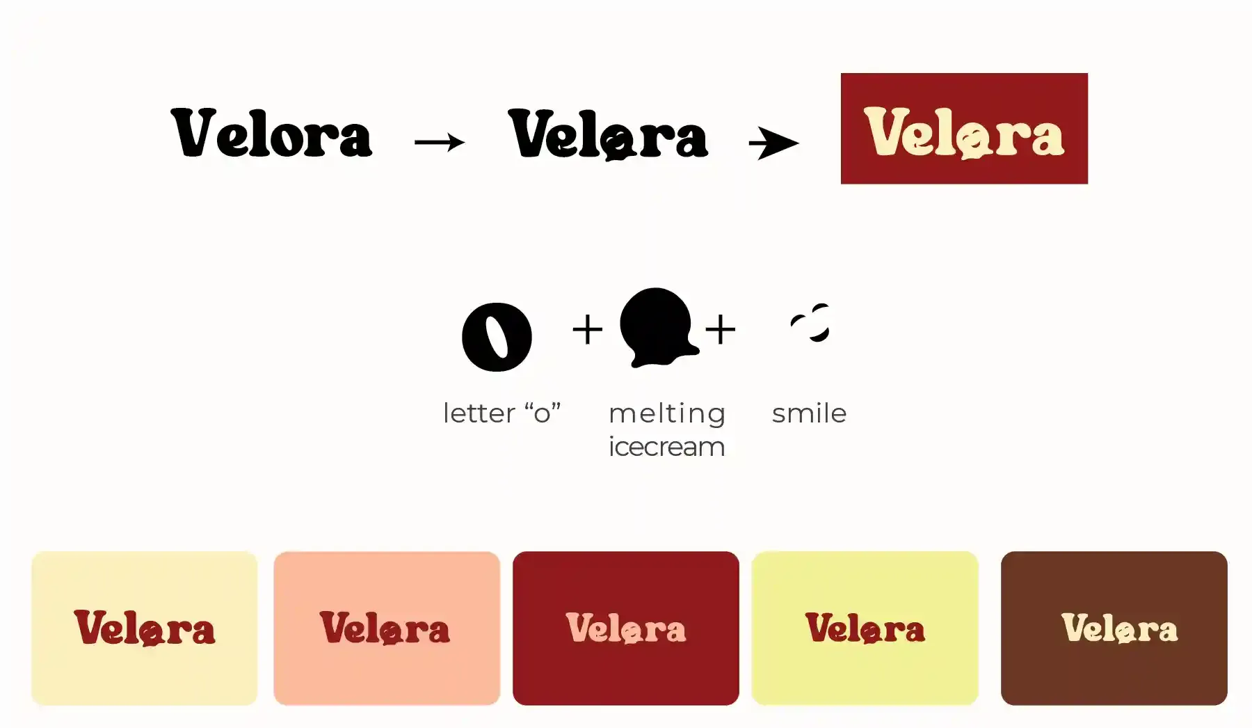
The 'o' in the wordmark integrates a melting ice cream shape — a direct promise of creamy texture before a word is read. Subtle smiles are built into the letterforms, making the brand feel joyful without trying too hard.
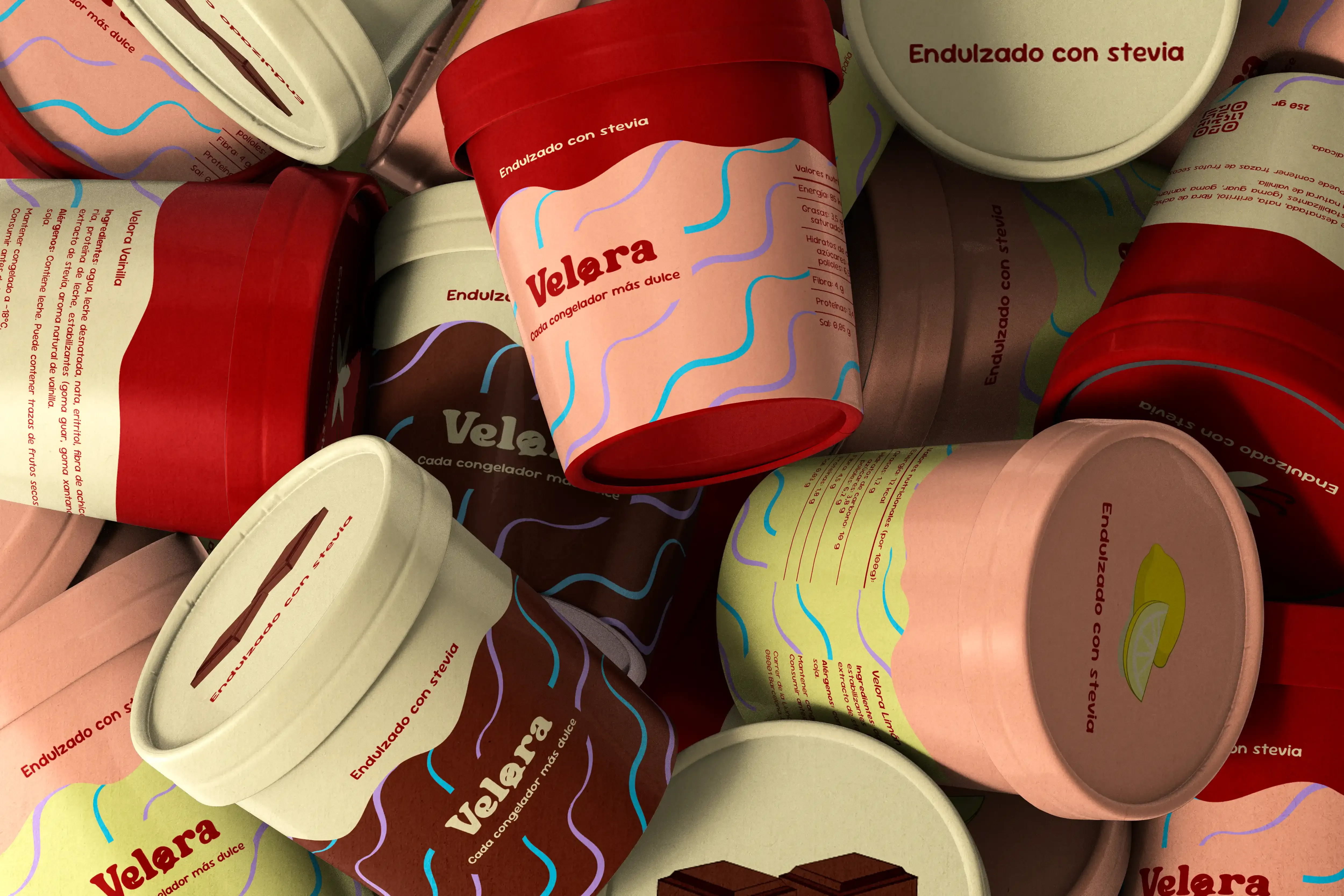
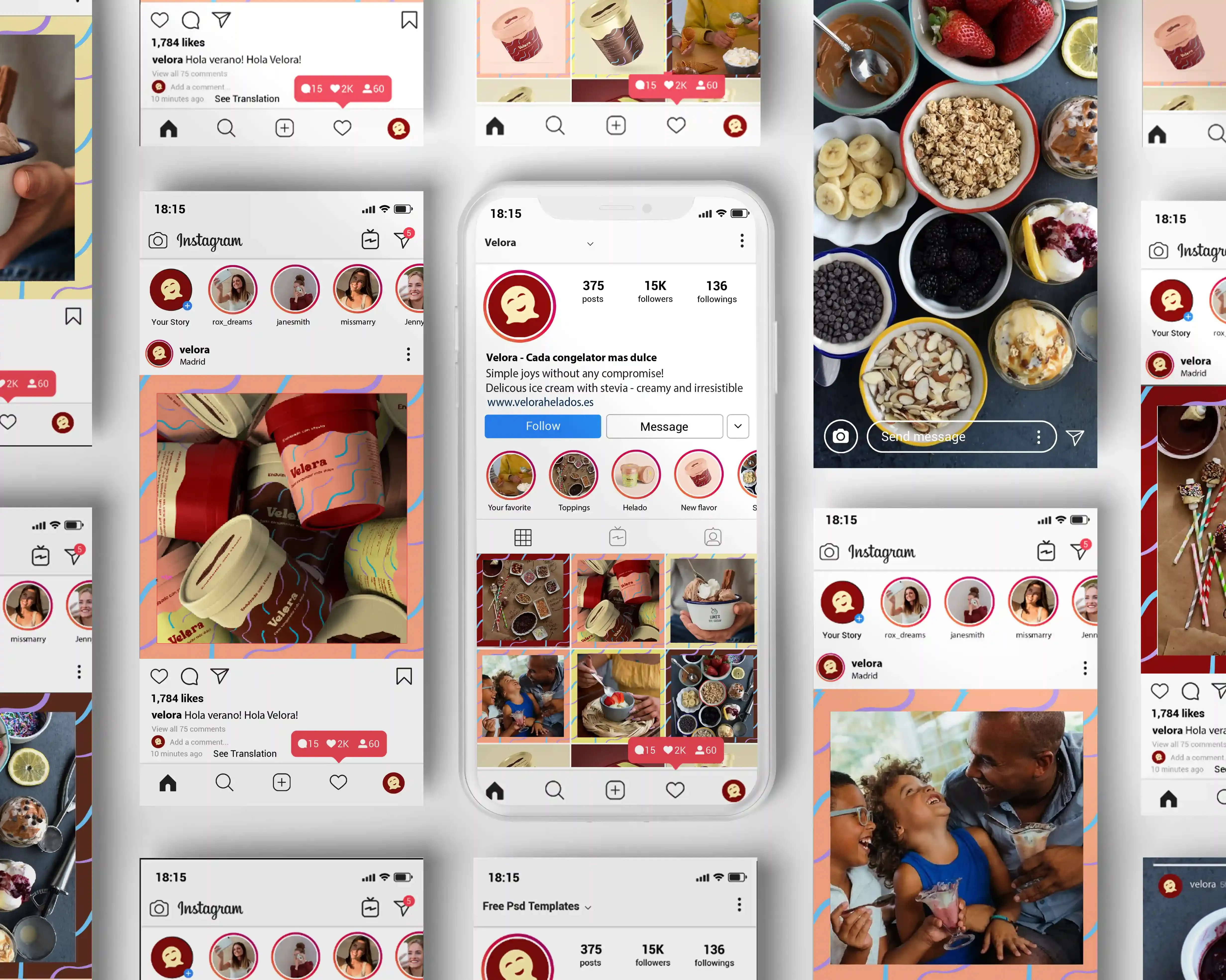
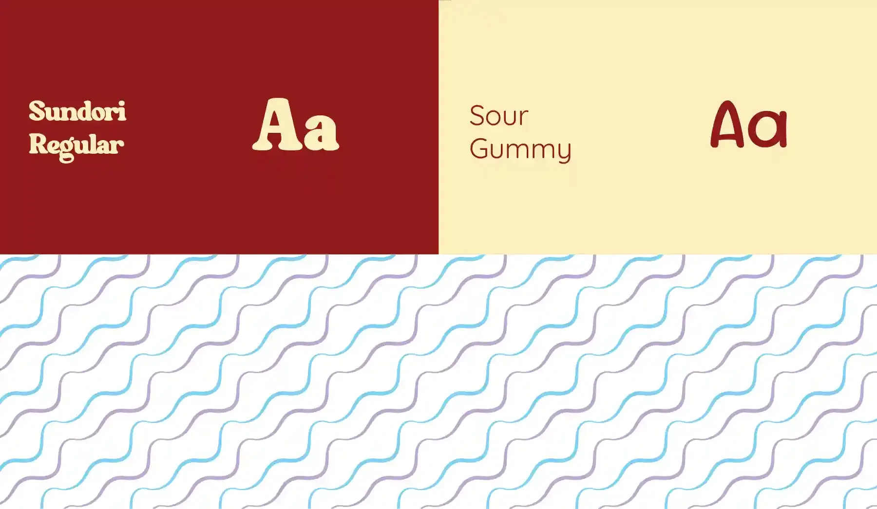
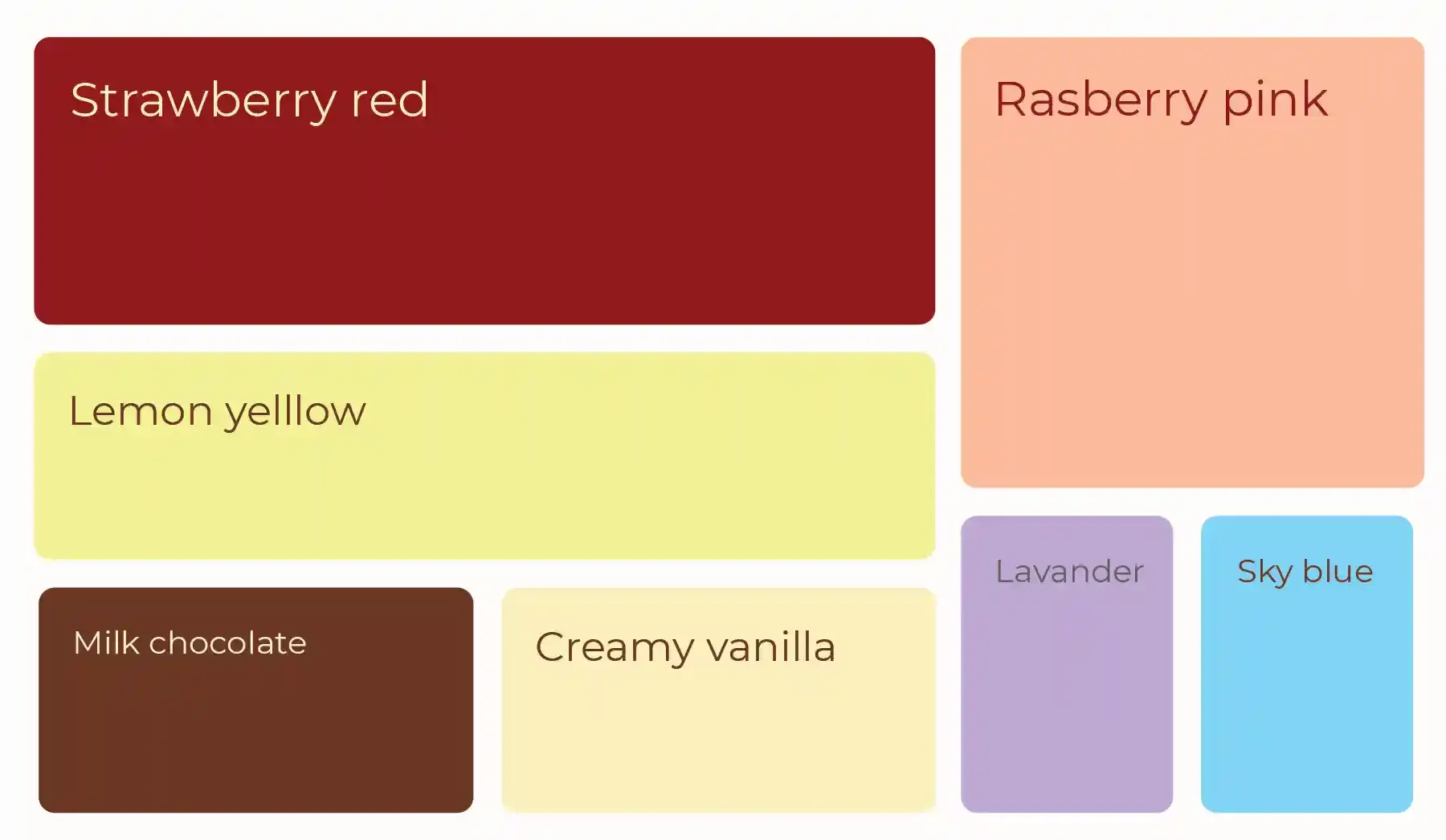
The palette is flavor-first: strawberry red, lemon yellow, chocolate brown, raspberry pink, creamy vanilla. Paired with Sour Gummy for supporting type, there's a two-speed system — the wordmark feels crafted and premium, the secondary type feels playful and warm. Parents read one. Children feel the other.
"Cada congelador más dulce."
Every freezer sweeter — written in Spanish intentionally. Velora is Madrid-born.