Onda
A textured hair care brand that had to feel like a scientist and a friend at the same time. Self-initiated project.
Meet Onda
Product Fatigue
There's a specific exhaustion that comes with having textured hair. Buying many products, chasing volume, definition, moisture. ONDA calls this Product Fatigue, and it's the problem the brand was built to solve.
ONDA targets Western, Central, and Eastern Europe — a market where the textured hair care category is underdeveloped, and where the education gap is even wider. The brand had to say: clinical authority and genuine warmth.
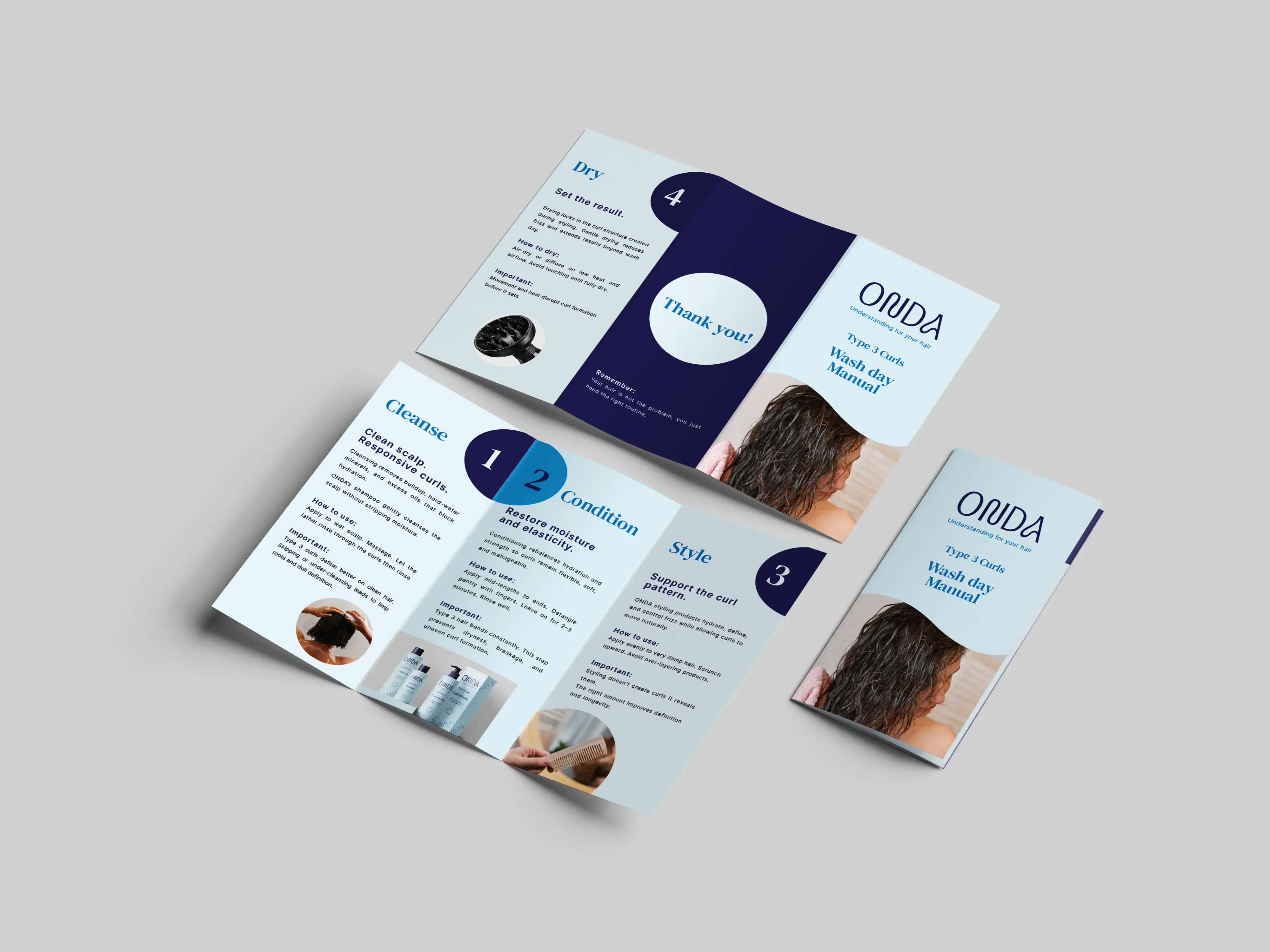
Education at the core
Customers feel overwhelmed by the products. They don't understand why they need a specific product. They want to understand why and how they work.
Education and clear explanations must be the core of ONDA. Each product must have a clearly explained purpose. The brand has to feel trustworthy and friendly at the same time.
Sustainability is also an important part of the brand. It provides starter kits and refillable options in order to reduce waste.
The design process
A system that teaches
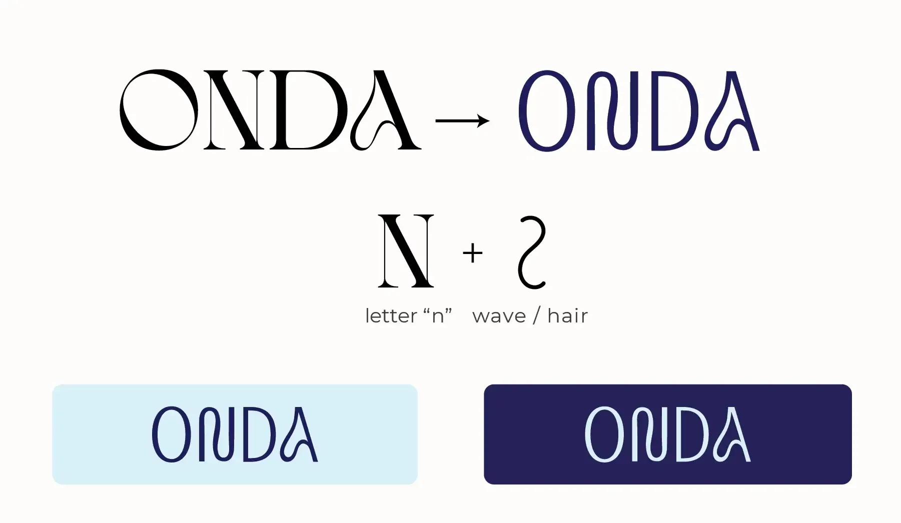
The 'N' in the wordmark integrates a wave and curl — referencing the brand name (onda means wave in Spanish and Portuguese) and the movement of textured hair. Uppercase letters signal confidence and expertise.
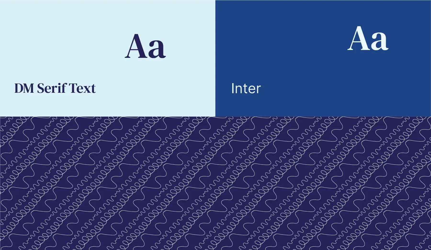
DM Serif Text was paired with Inter. The serif carries scientific authority and premium care. The sans-serif communicates modern clarity. Together they create a visual conversation between science and nature — exactly what the brand stands for.
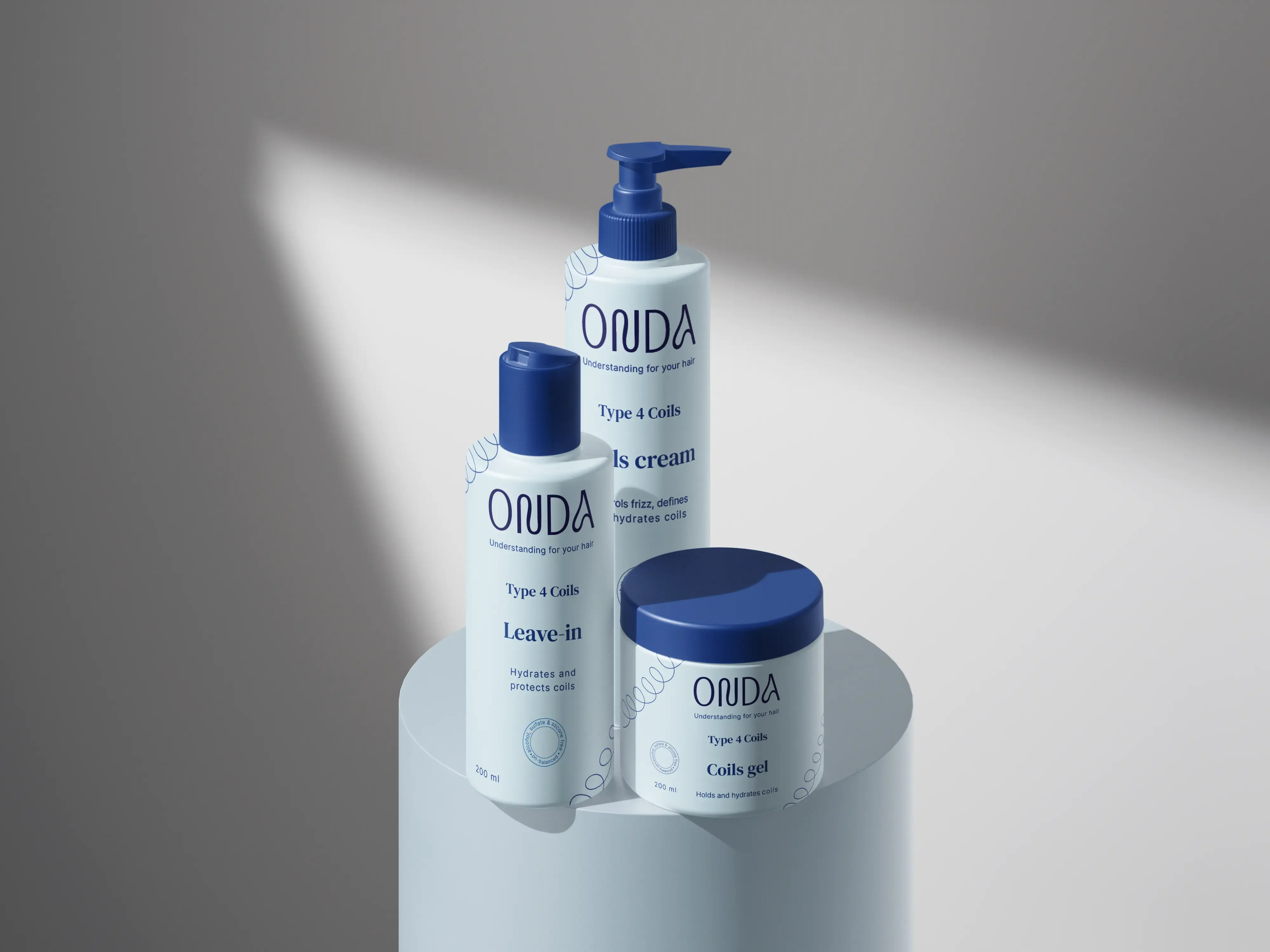
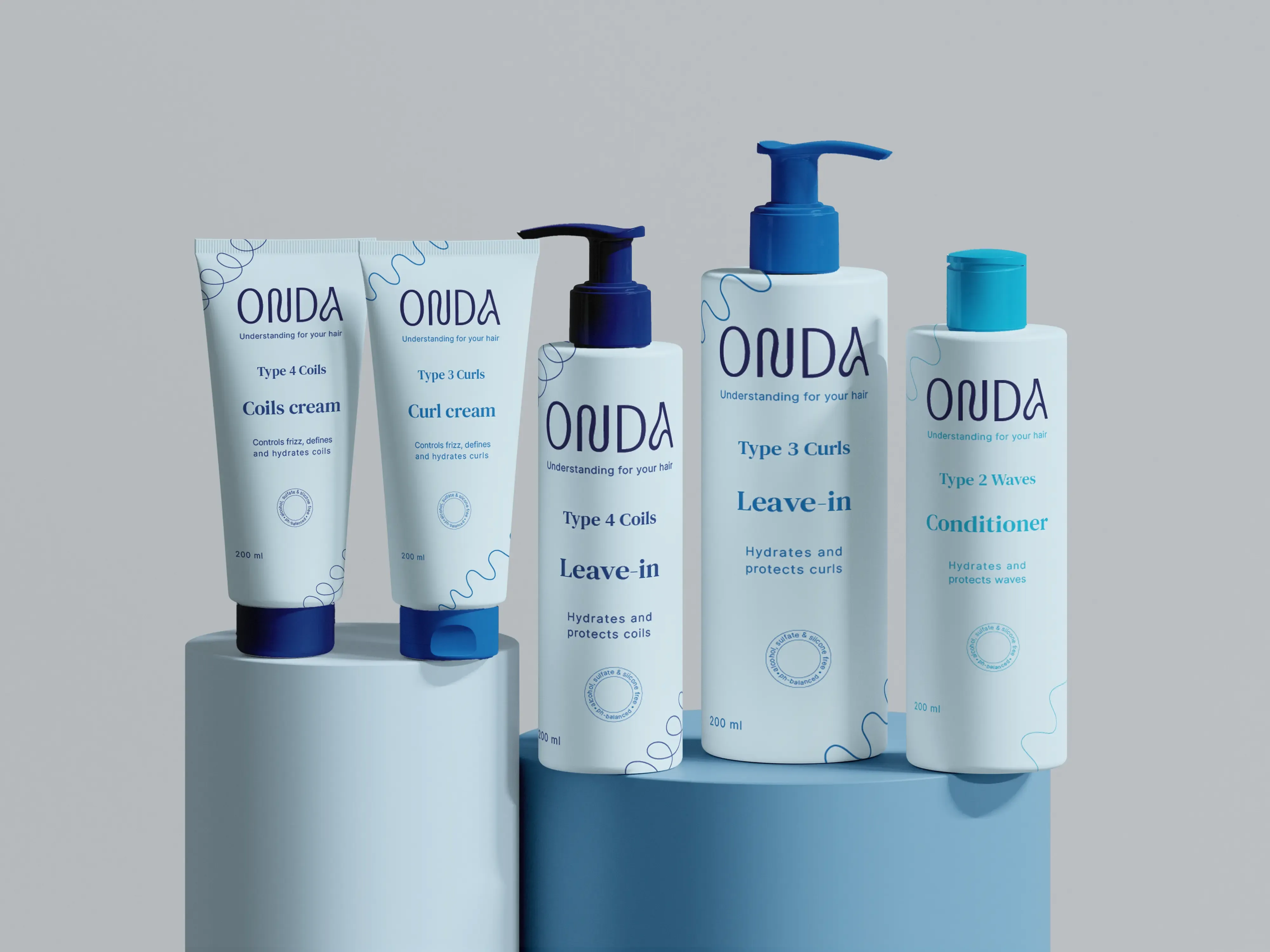
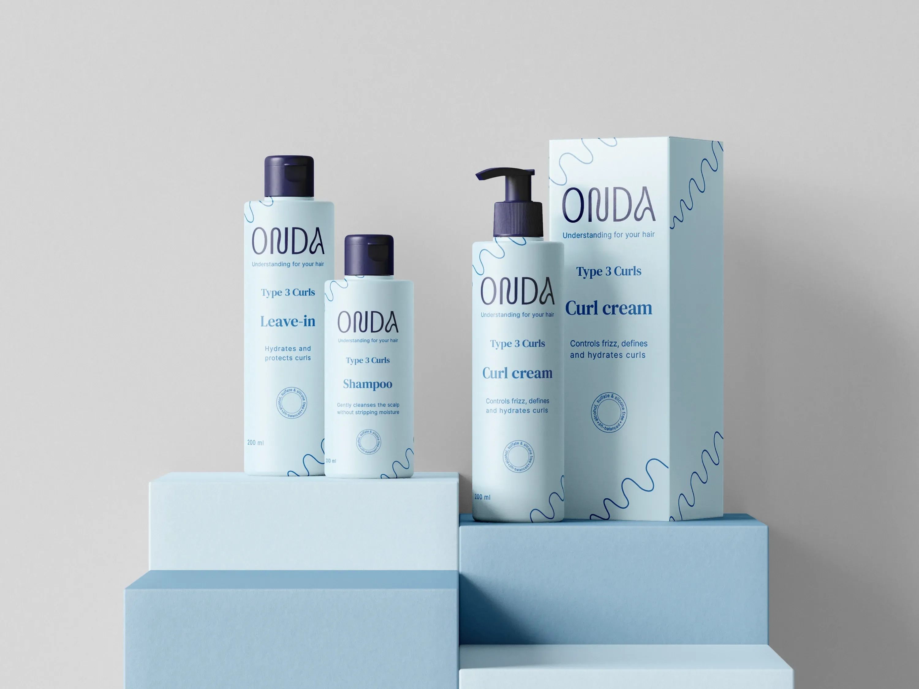
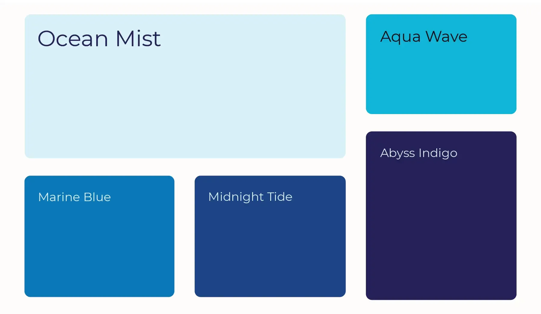
The blue palette builds from Ocean Mist through Marine Blue to Abyss Indigo. The packaging architecture — Type 2 Waves, Type 3 Curls, Type 4 Coils — is built directly into the labels. Customers navigate to their product without explanation. The classification system is the education made visible.
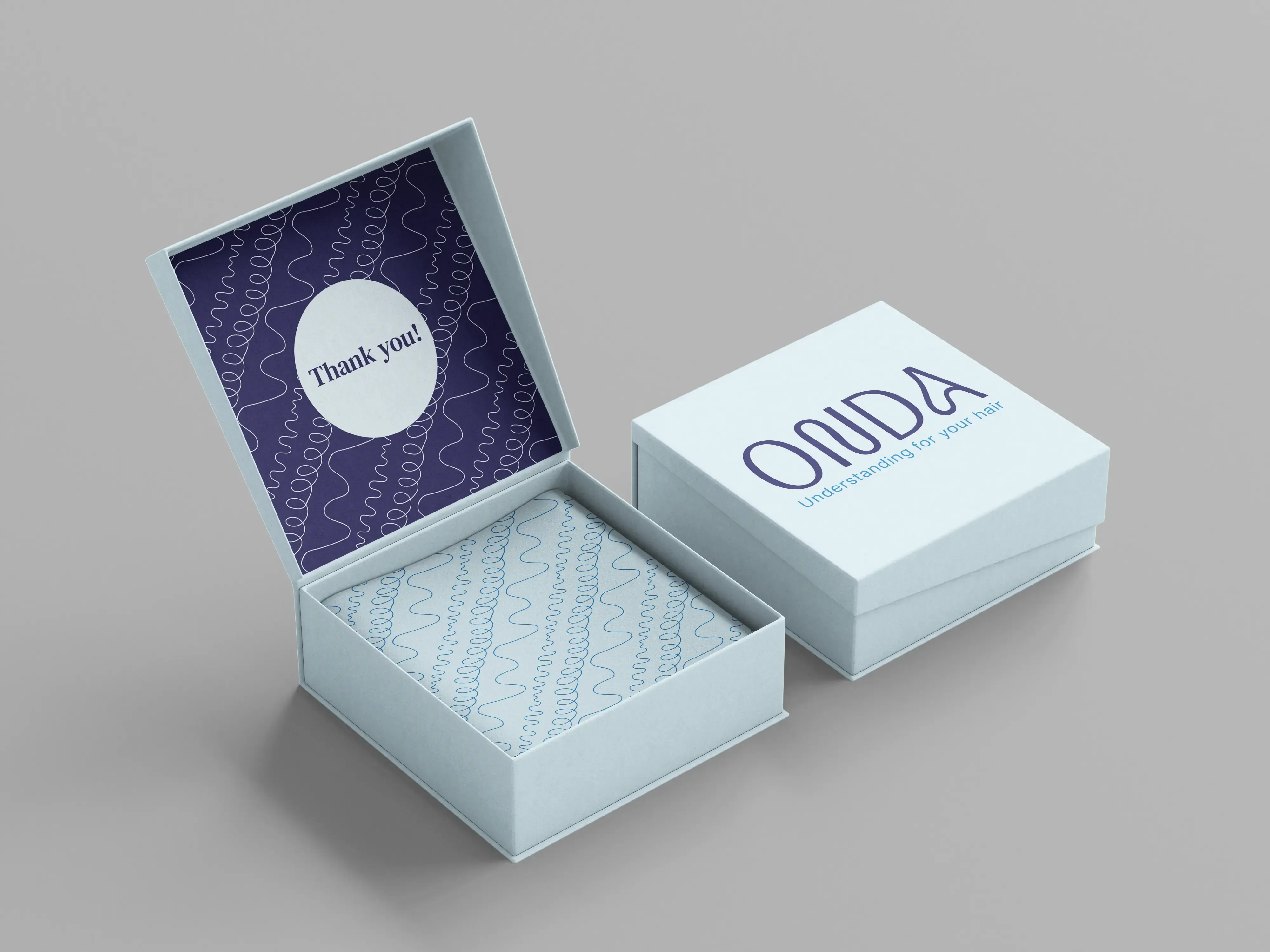
"Understanding for your hair"