Veganzza
A vegan Italian restaurant based in London, that had to feel premium and affordable at the same time. Self-initiated project.
Meet Veganzza
Built for the everyday diner
Vegan restaurants charge prices that exclude most people. Budget options sacrifice the one thing Italian food is built on — flavor and texture. Veganzza was built to create the missing piece: authentic Italian taste, completely plant-based, genuinely affordable for London's everyday diner.
The visual system had to read premium enough to trust the taste, accessible enough to walk in whenever you feel like.
Italian first, vegan second
Vegan restaurants in London are: clinical minimalism or rustic and warm. Neither says "real Italian restaurant that is vegan."
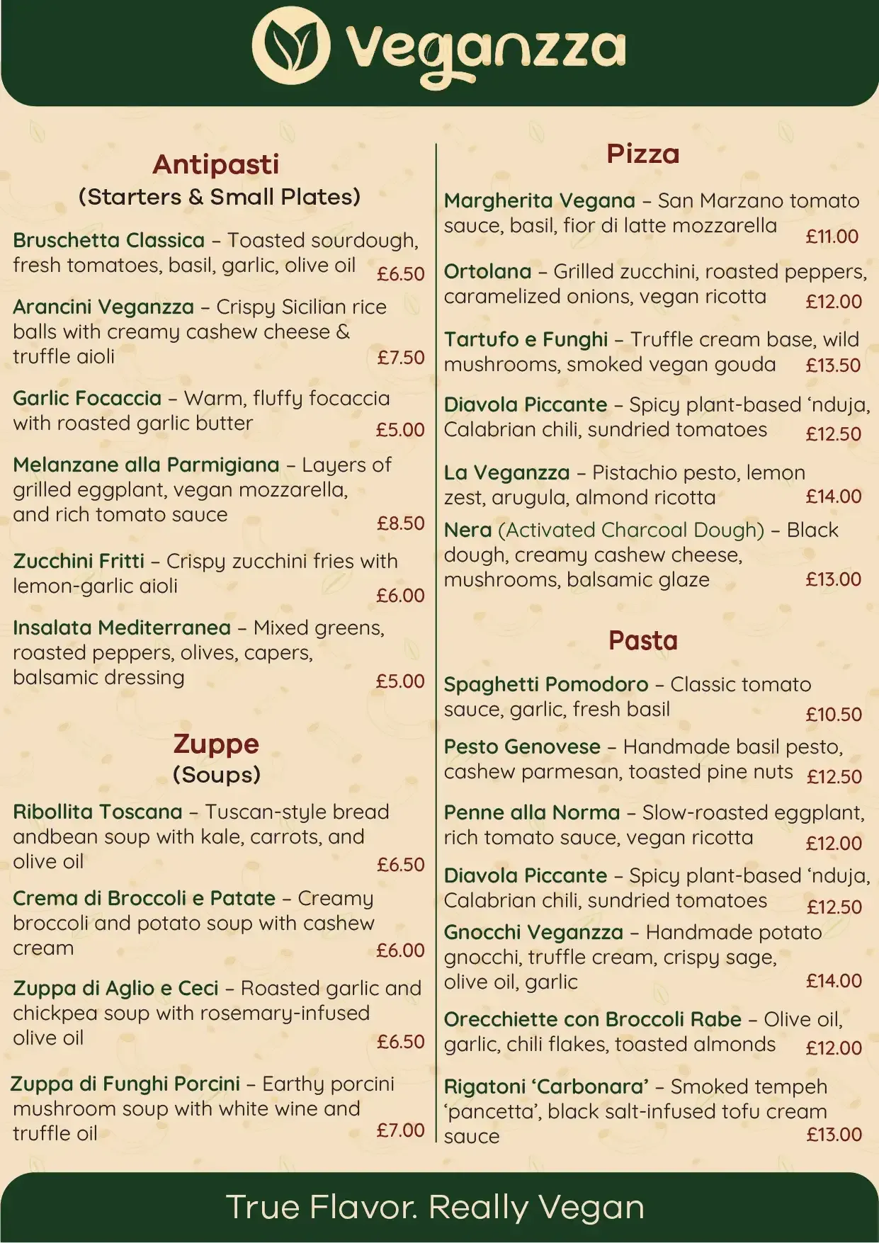
Italian authenticity first. The plant-based part is secondary. The tagline says it plainly: True flavor. Really vegan.
The design process
A palette that earns trust
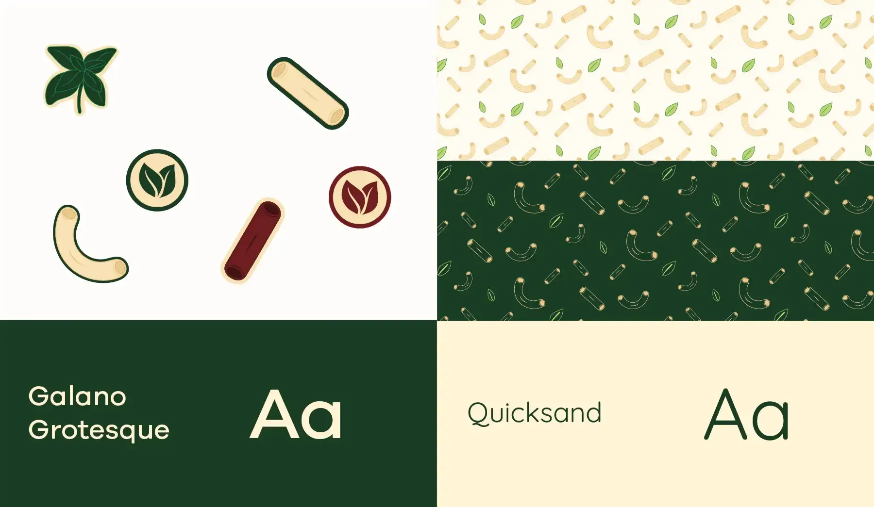
The color palette focuses on Italian heritage. Basil green for plant-based commitment. Italian red to trigger appetite. Pasta cream for the warmth of fresh dough.
The logo combines a basil leaf, the letter 'g', and a pasta shape. The basil does the heavy lifting — instant shorthand for Italian cooking and real seasoning. The pattern system extends the identity across every surface: pasta shapes and basil leaves scattered together, specific enough to be ownable across every touchpoint.
Typography pairs Galano Grotesque with Quicksand — modern and clean, warm enough to feel welcoming.
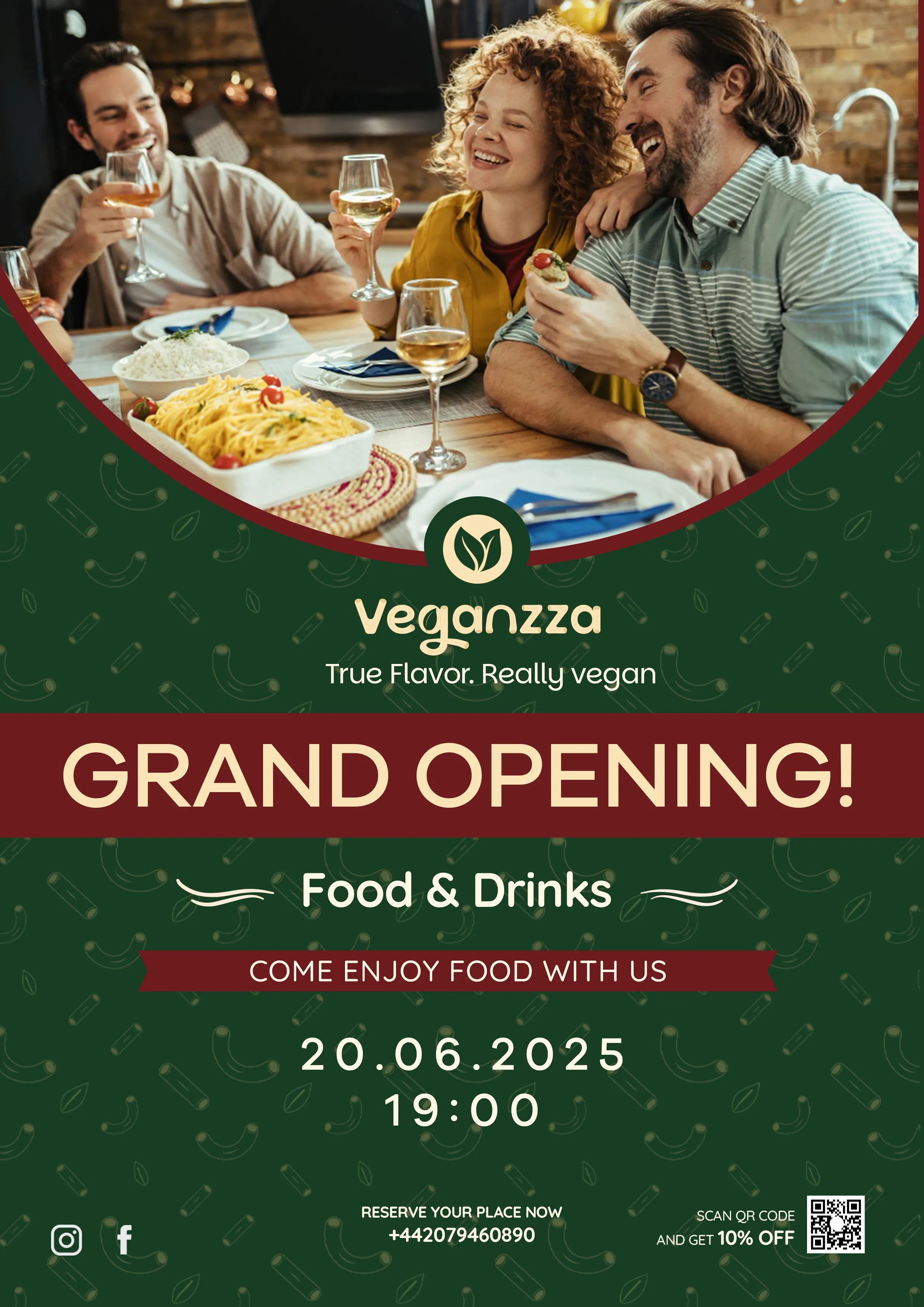
"True flavor. Really vegan."