Blummies
Fruit-forward gummy candy that had to be fun without looking artificial. Self-initiated project.
Meet Blummies
Stuck between two failure modes
Better-for-you candy is stuck between two failure modes. Health brands look clinical — white packaging, medical fonts — and nobody believes the texture will be good. Candy brands look artificial — neon colors, sugar-rush aesthetics — and nobody believes the health claims.
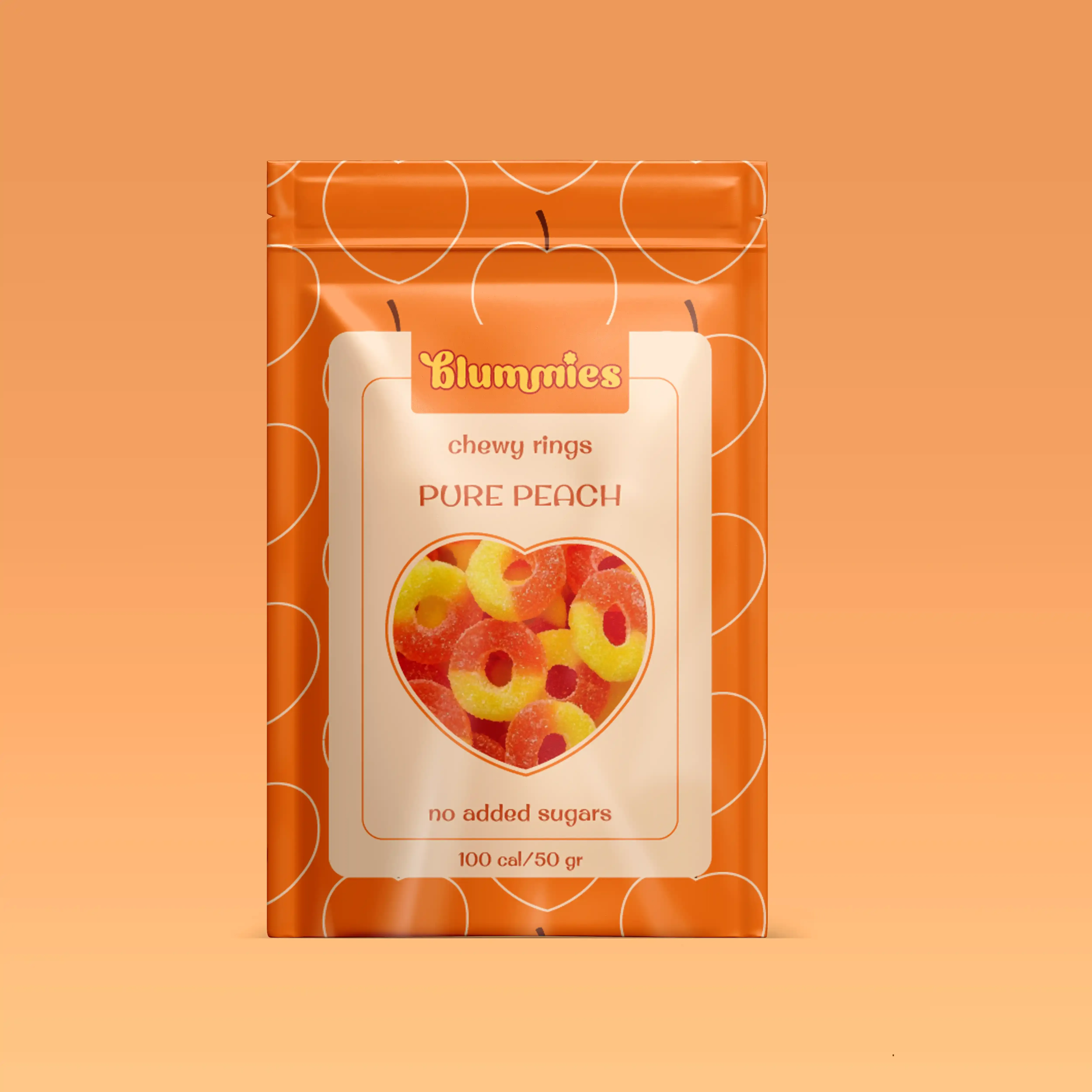
Blummies is a Berlin-based brand targeting the Northern European market — a consumer base that is both health-conscious and deeply skeptical of wellness claims. The visual identity had to find the exact gap between "neon candy" and "health food medicine" and hold it convincingly.
Joy as the signal
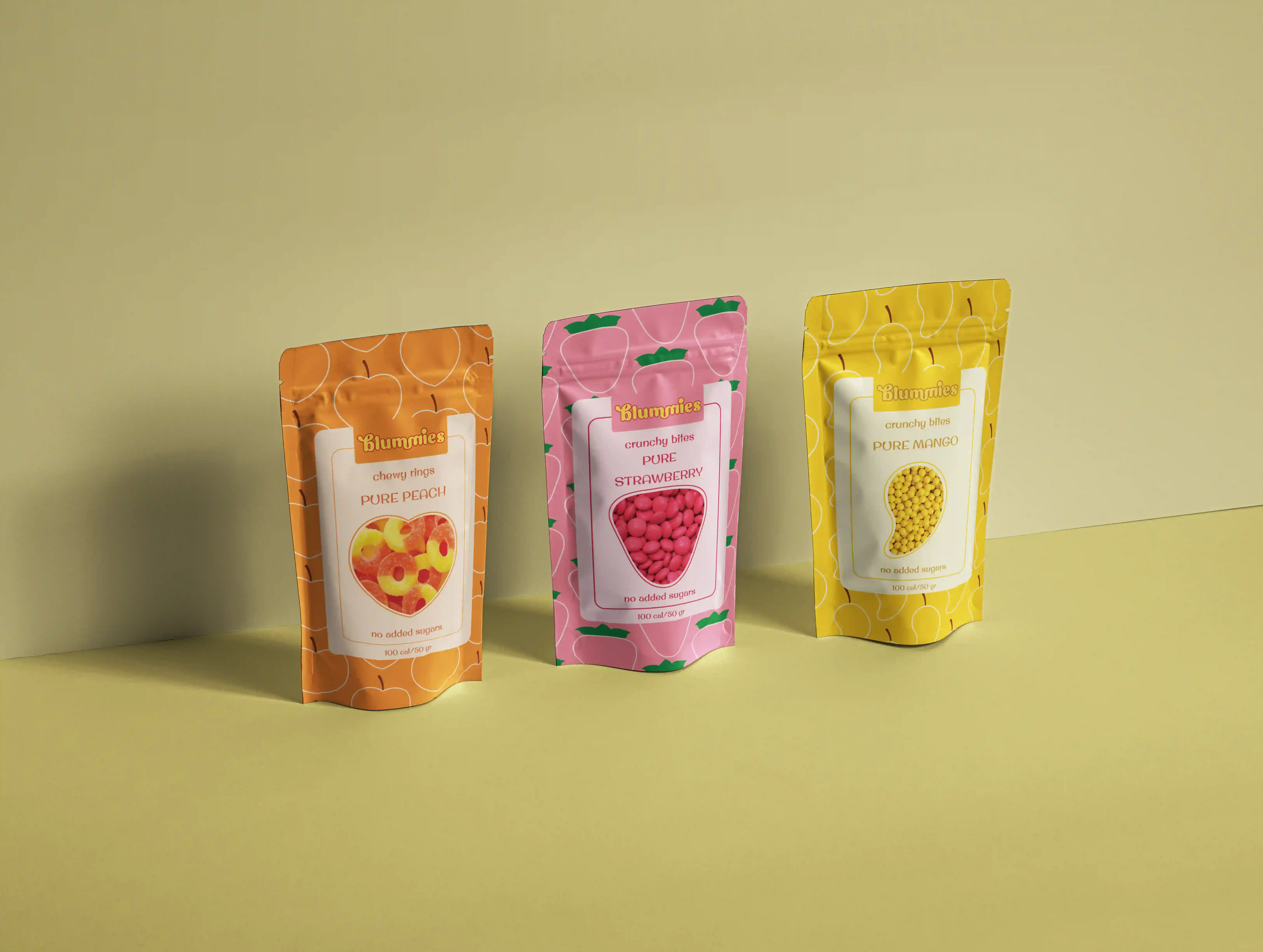
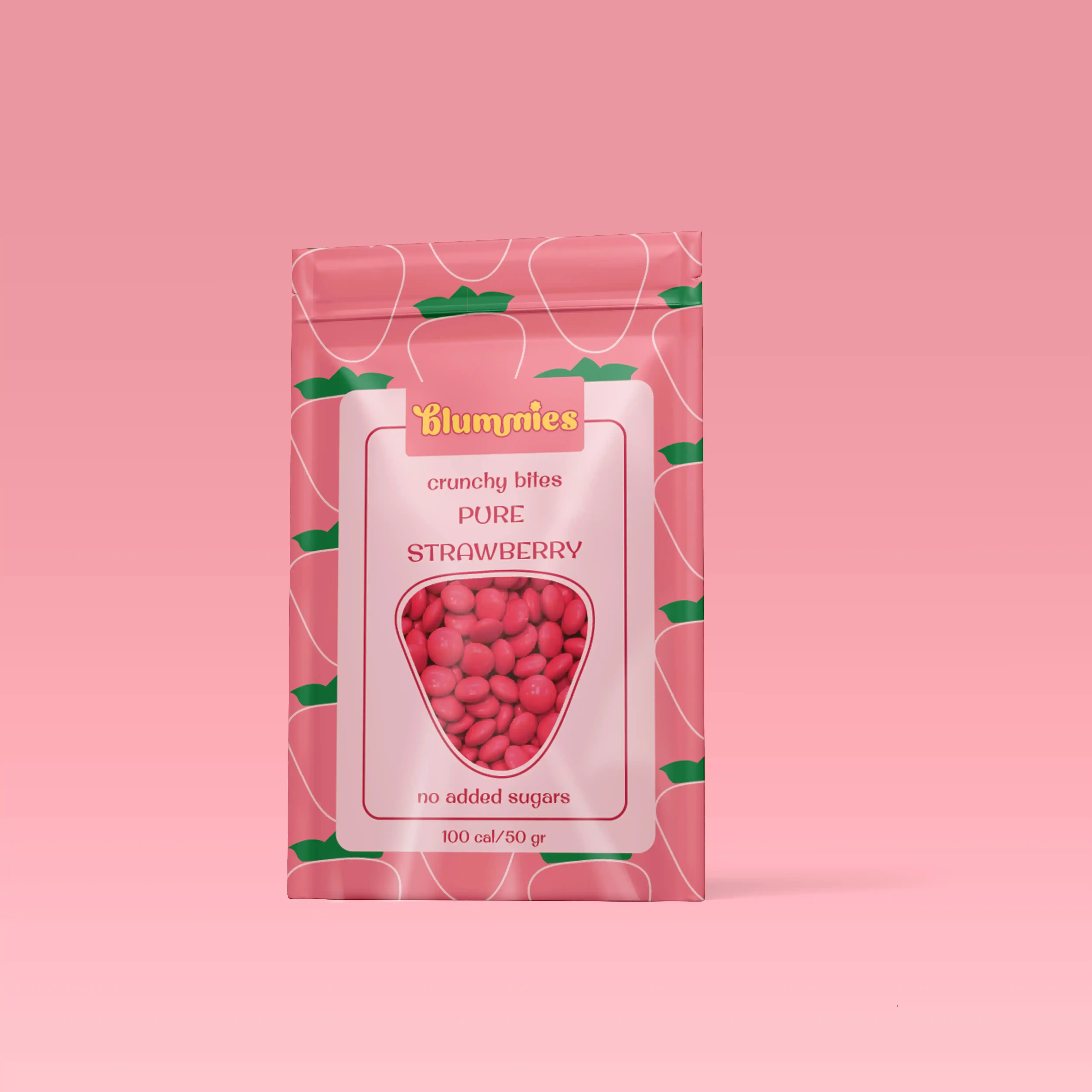
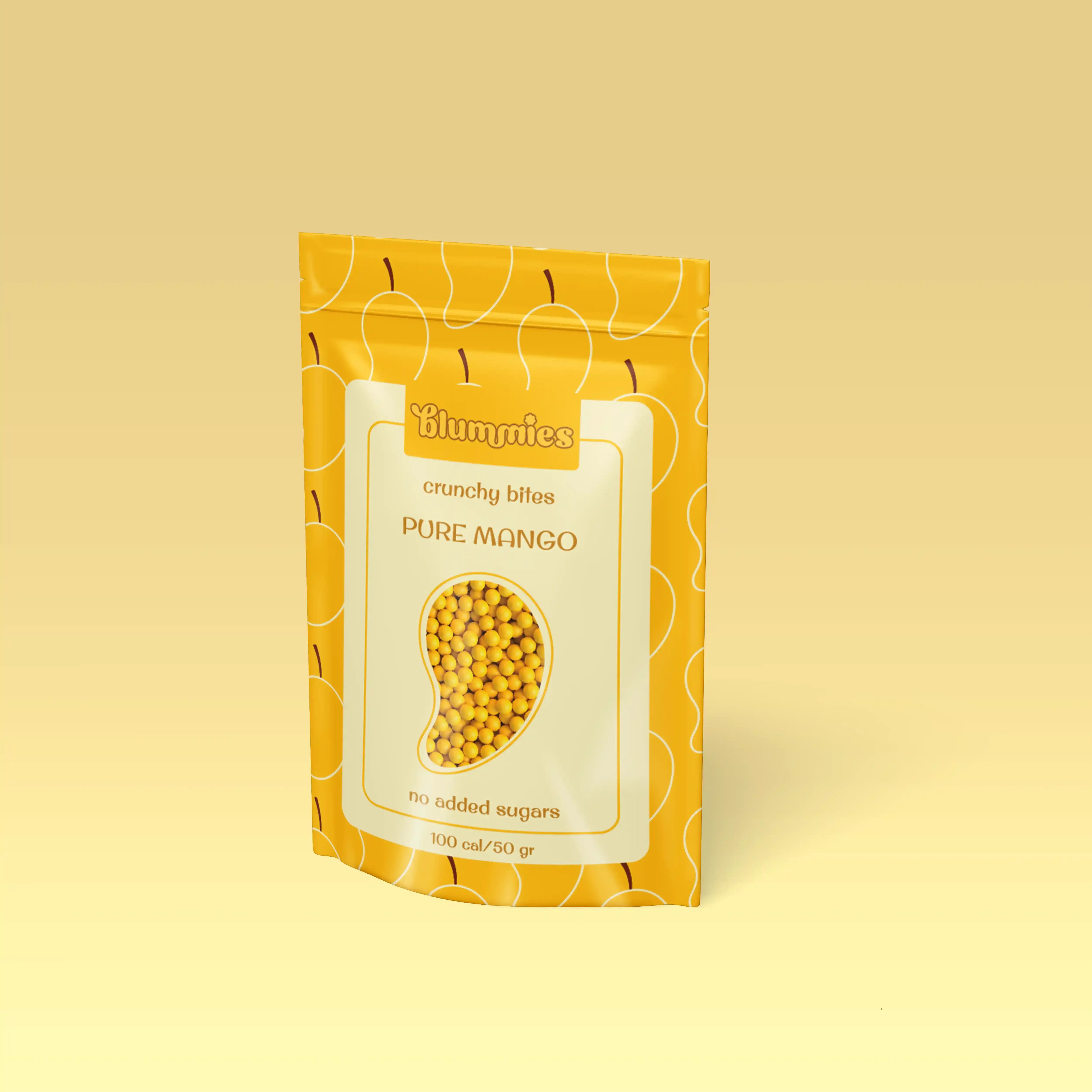
The brands winning in natural candy across Northern Europe lead with joy and use ingredients as visual proof. Showing the actual fruit builds more trust than any health claim on the back of the pack. That became the foundation of the whole visual system.
The design process
Warm, fruit-forward, precise
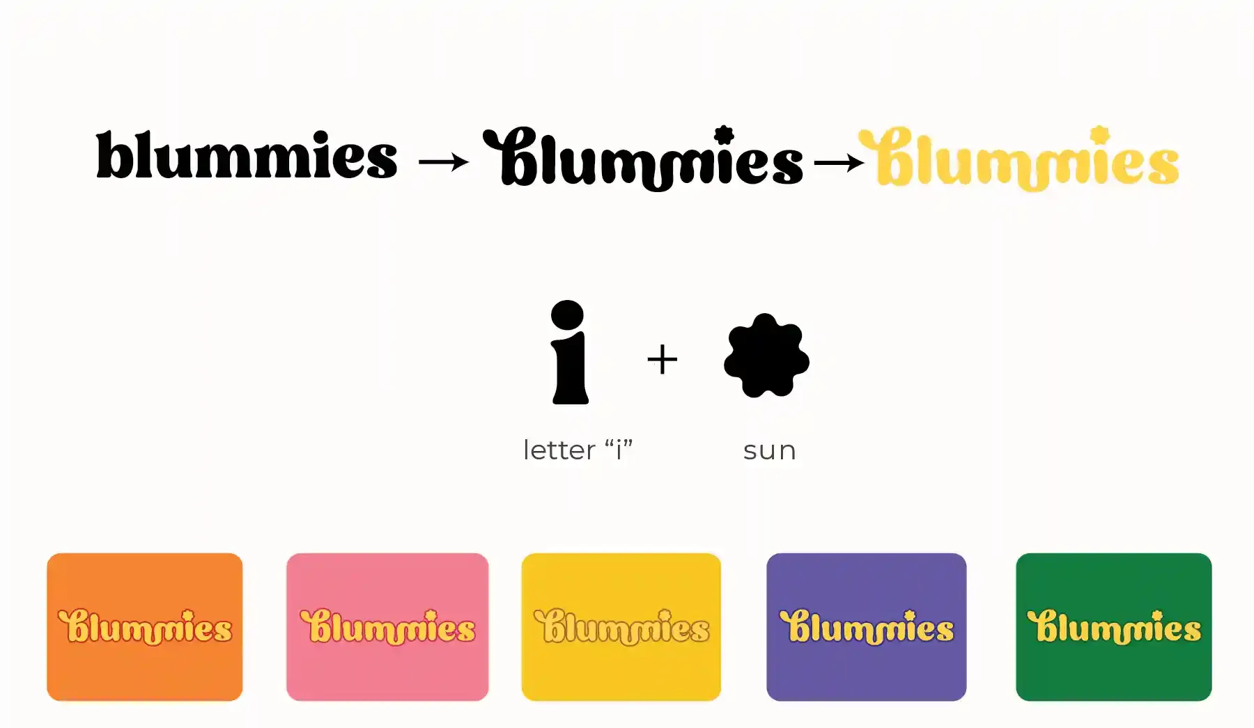
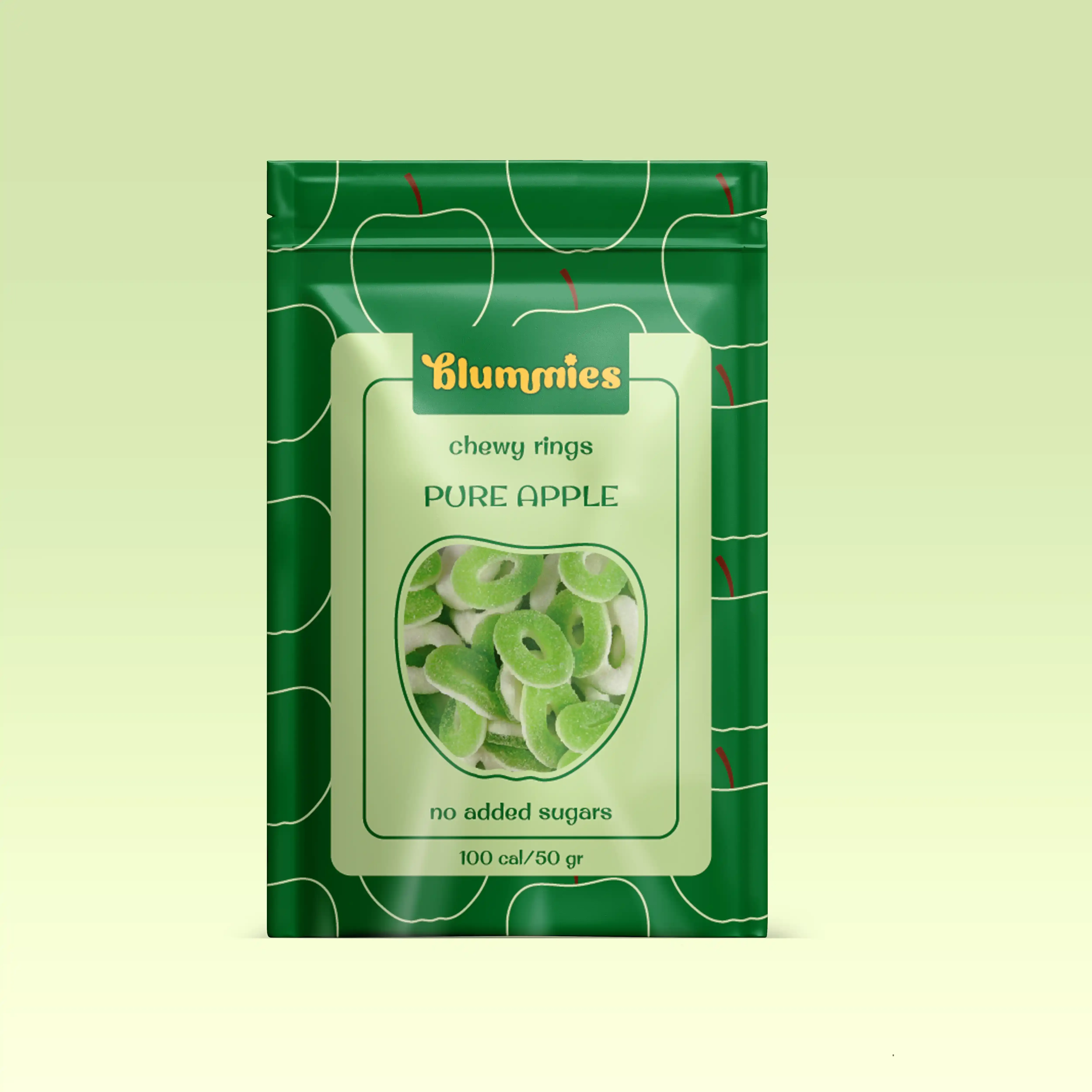
The rounded lowercase wordmark is warm and approachable. The sun replacing the dot on the 'i' carries two meanings: the natural light that grows the fruit, and the small daily joy the product is meant to bring.
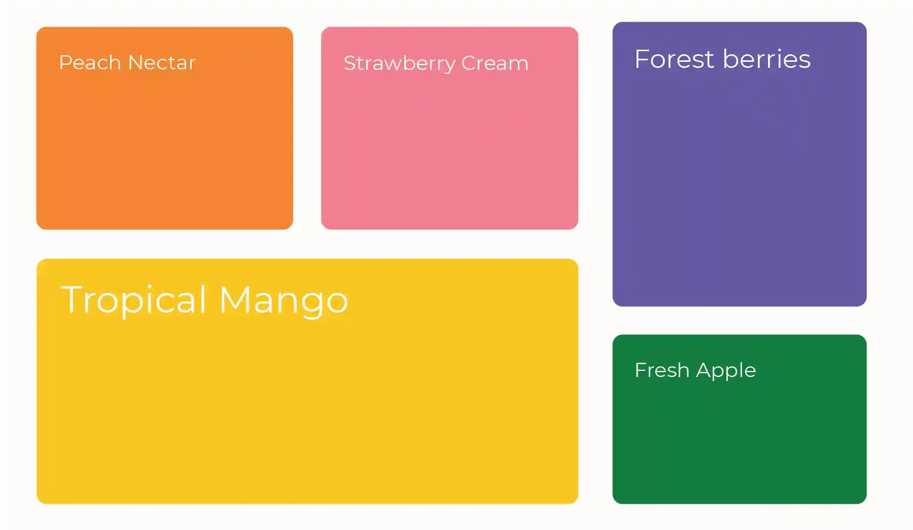
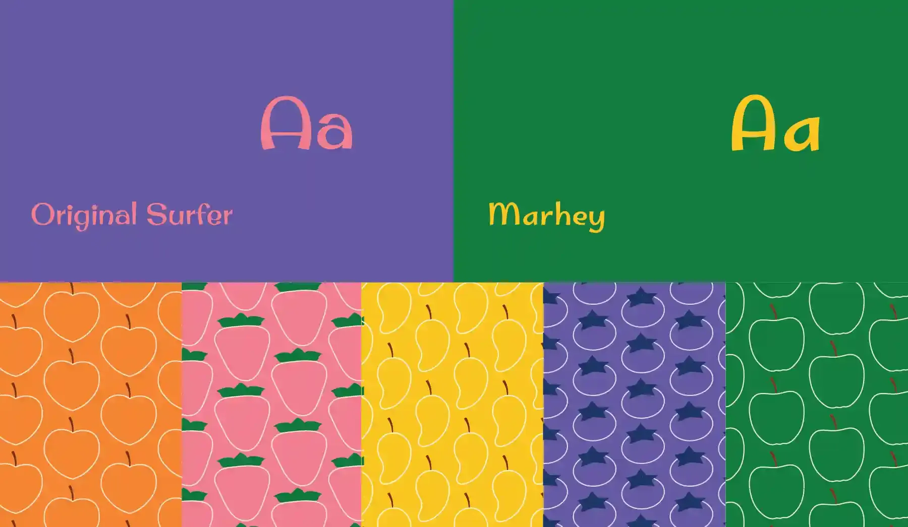
The color palette is sourced directly from the fruit ingredients. Peach orange, strawberry pink, mango yellow, berry purple, apple green. Vibrant but not neon — the specific difference that signals real ingredients to a Northern European consumer trained to spot the distinction. Each color maps to a fruit, each fruit to its own repeating pattern across two typefaces: Original Surfer and Marhey.